Kobo Art
by Badri Sunderarajan · Fri 06 October 2023
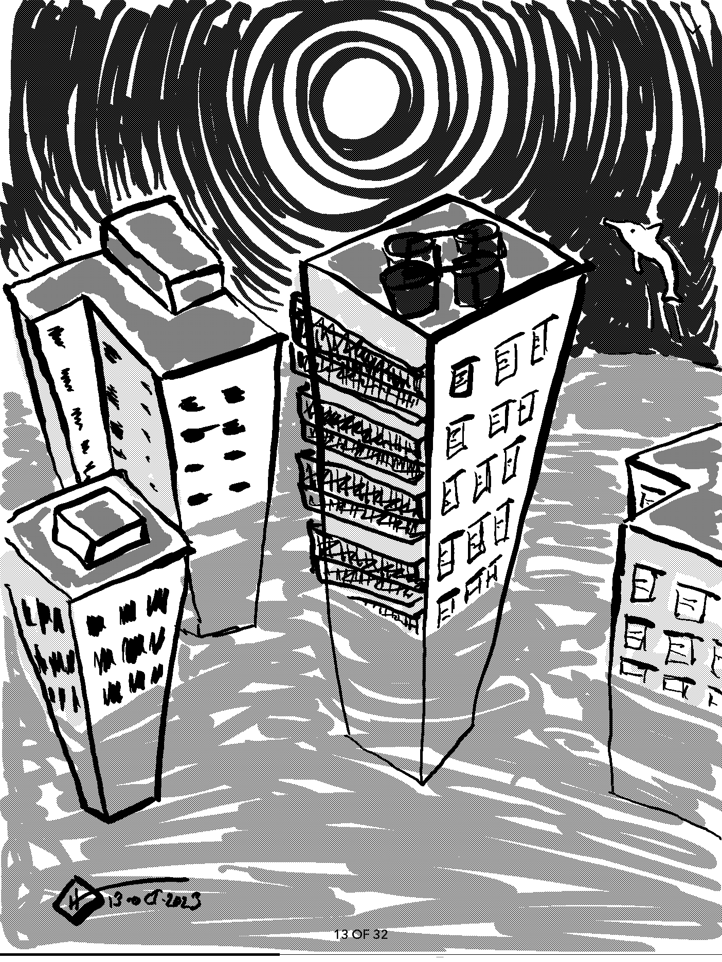
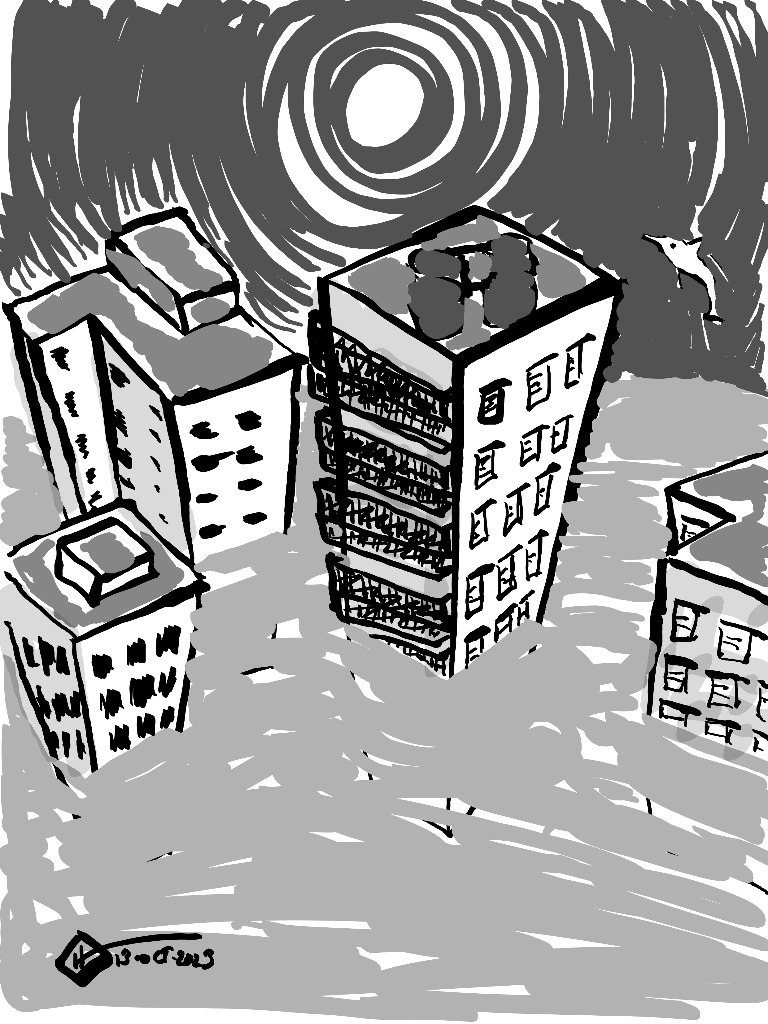
I've been using my Kobo Elipsa for Inktober sketches this year, and have gotten used to some of its quirks. The thing about Kobo drawings is that they look a certain way on the e-paper screen, but then turn out a different way when exported I don't think this is all due to the nature of e-paper; I think it's also about how the software renders things.
Take the highlighter tool, for instance. Inside the Kobo notebook, I can run the highlighter over an area as many times as I want, and it'll result in a smooth, uniform colouration But export that to a PNG or PDF, and the highlighter will become uneven like a real-world highlighter: darker where I ran it across more times, and lighter where I wielded it less.
Another discrepancy is in the way the colours overlap. I say "colours", but using a black and white device what I actually mean is shades of grey). On the Kobo, if I draw with a darker colour and then colour over with a lighter colour, the lighter colour will end up behind the darker one, being overpowered by the letter in much the same may sketch pen colours are (but not exactly the same, because sketch pen colour pile up and end up being very dark if you layer too many of them).

When I export the shader to a PDF or PNG, however, the overlapping happens like acrylic instead: each stroke covers the one that came before so if I put a lighter colour after a dark one the light colour will cover the dark one and come on top.

Interestingly, these changes only happen for exports. When I indeed have the drawing open on my Kobo and take a screenshot, the screenshot ends up looking the same way as the original drawing does on the Kobo itself: smooth highlights, dominating colours, and all the rest.That makes a handy way of getting Kobo-style drawings to other devices, but it also proves that the discrepancies are due to the software, not the screen.
At first, I was inclined to think that Kobo's software was rather buggy and needed to be fixed. But then it struck me: perhaps, instead of trying to use it the same I would use real pens, brushes, highlighters, and paper, I should treat Kobo illustration as a different art form.
Not all art looks the same while working on it as it does in the final version. (Rhea, he works with watercolours, will know what I'm talking about!) Materials often dry, or settle, or get developed or change in some other way before getting frozen into their final and permanent form. Watercolour paints dry and become darker. Clay shrinks a bit and, depending on what kind it is, becomes lighter. Sketch pens may fuzz up and take over more of a thin page. Papier mâché hardens and becomes stiffer. Analogue photographs reverse their colours, and that's only after you've processed them enough to actually be able to see them
And, on the Kobo, highlights become layered, newer strokes rise to obscure older ones, and the drawing, perhaps undergoes many other subtle changes that I'm yet to discover and master.
